


Brand strategy, messaging, identity and a website for a more connected approach to space innovation.
Project Overview
Making a complex mission clear.
- The situation
- Jemba9 brings engineering, assurance, manufacturing and hands-on delivery together to help space innovators turn ambitious ideas into mission-ready systems. It needed a brand that connected those pieces, so technical teams, partners and investors could see what Jemba9 stands for and why its approach matters.
- What Wise+Hype did
- Wise+Hype led a collaborative brand workshop that aligned the business around its purpose, positioning, audiences and personality. That foundation shaped one narrative—turn complexity into clarity and help mission-critical teams move faster with confidence—carried through the strategy, messaging, verbal and visual identity, and a website that makes a complex offer easier to understand.
- Industry
- Space & advanced technology
- Services
- Brand Workshop
- Brand Strategy
- Brand Messaging
- Verbal Identity
- Visual Identity
- Website
Working on something similar?
Messaging & Verbal Identity
Technical fluency. Human clarity.
We developed the messaging and verbal identity to make the story clear, direct and grounded. One narrative connects the offer, with different entry points for each audience—balancing the ambition of space innovation with the practical realities of engineering, assurance and delivery.
Visual Identity
Built around connection.
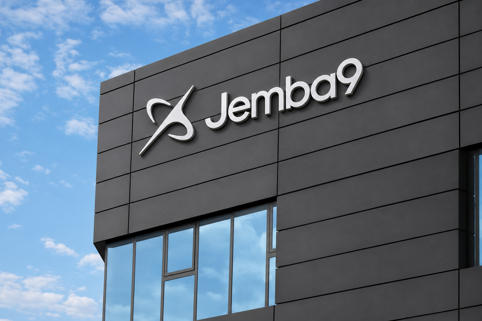
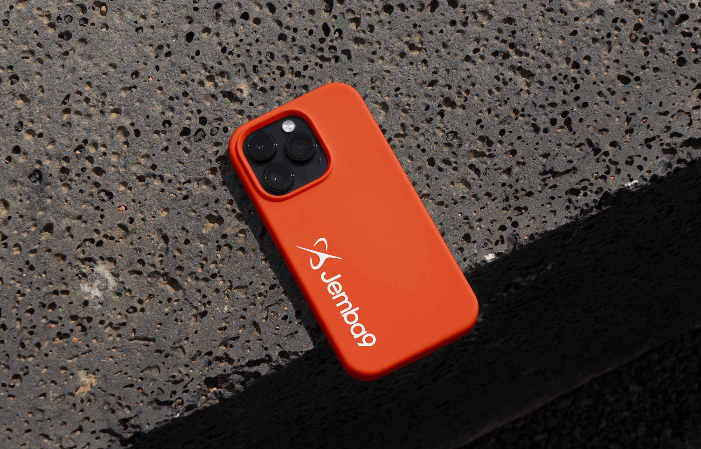
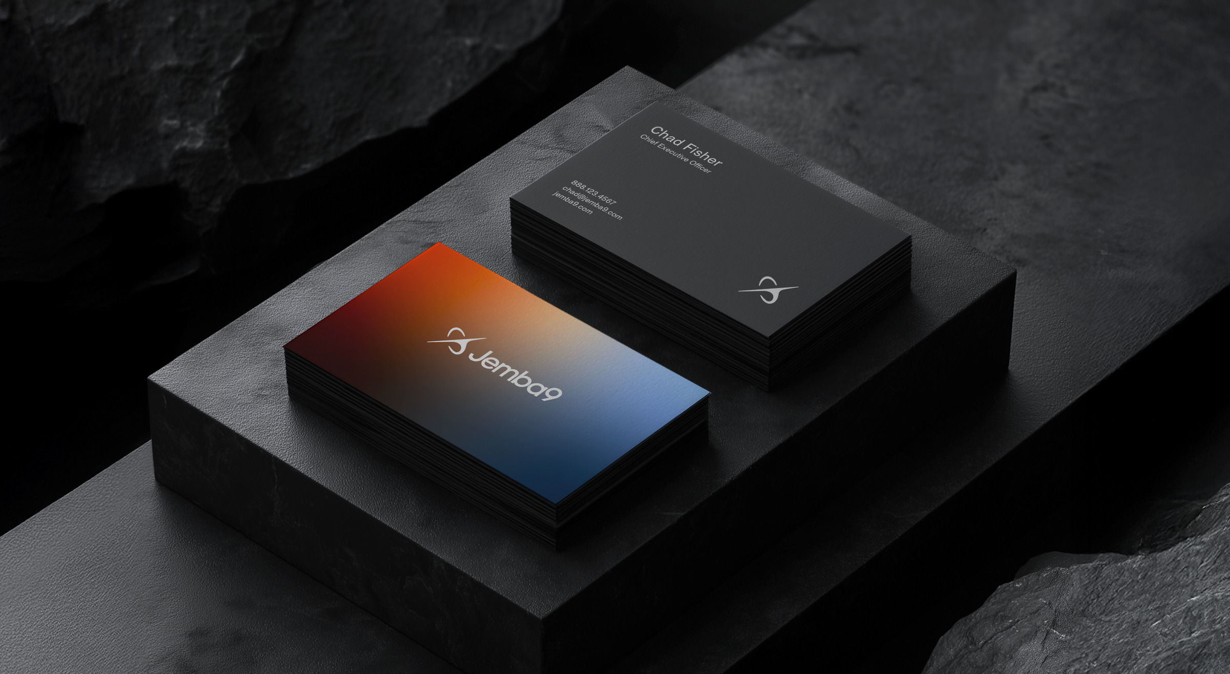
A distinctive identity translates that strategy into a recognizable visual system. The orbital J9 symbol, wordmark, orange accents and precise typography bring connection, visibility and forward momentum into a consistent brand language.
Website
Make the offer make sense.
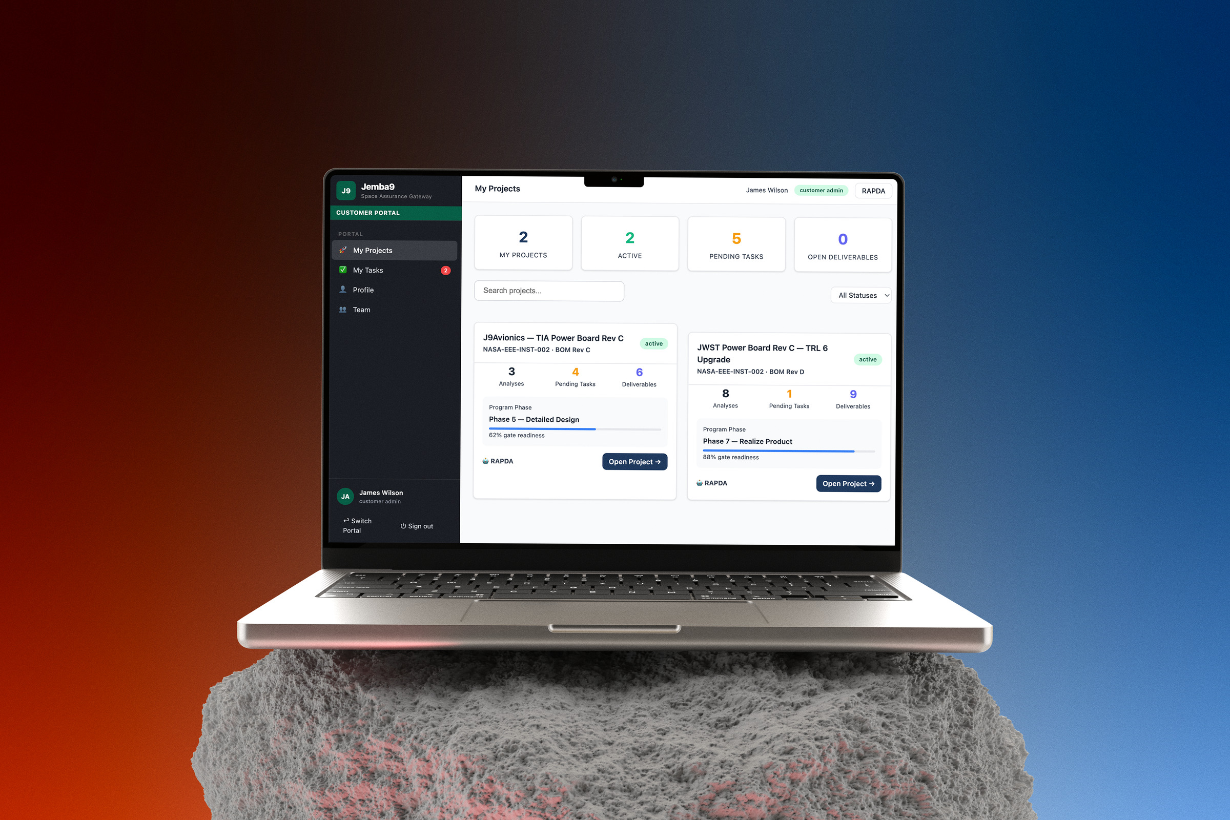
We brought the brand into a website that connects the story, capabilities and platform. Clear hierarchy and purposeful motion help visitors move from the big idea to the details, with a direct path to starting a conversation.
Closing
One connected brand.
From the first workshop to the website, the work gives Jemba9 a consistent foundation for explaining its business and showing up with clarity and confidence.


