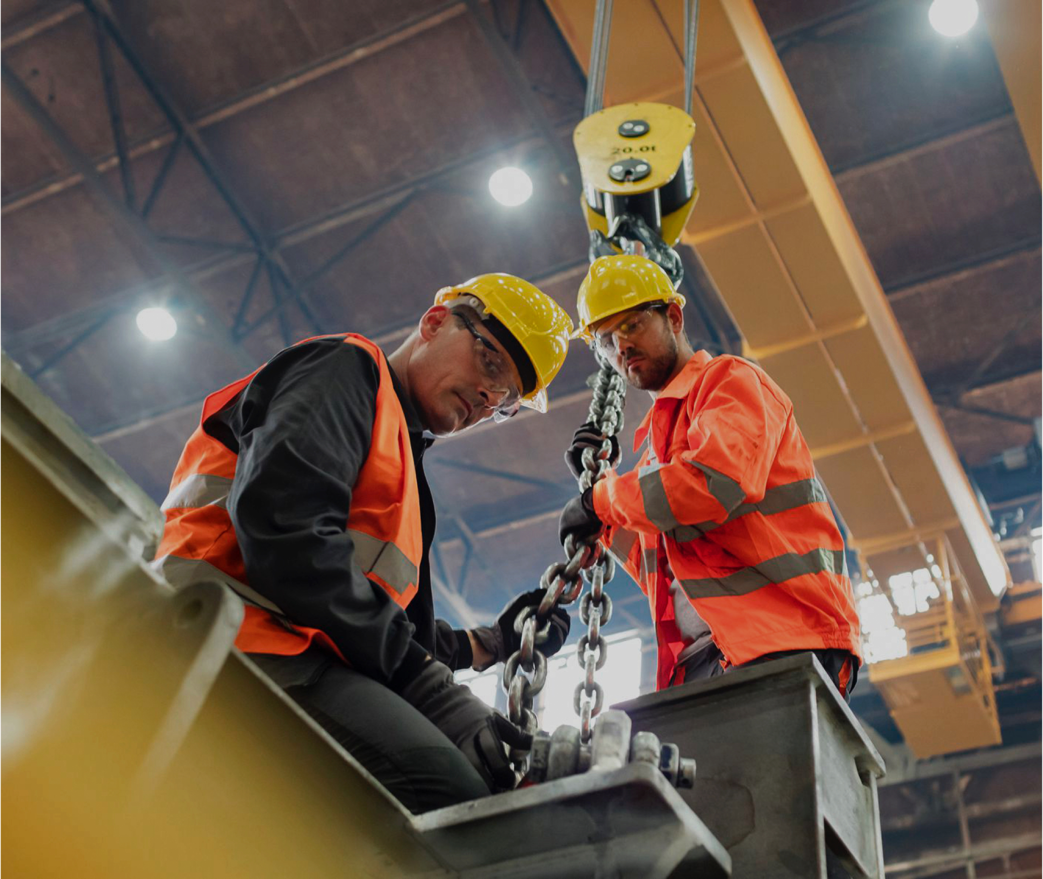
Family owned since 1945, Arbill is the leader in workplace safety protective products, services and technology.
Project Overview
Protecting the toughest workers on the harshest jobsites
- The situation
- Since 1945, family-owned Arbill has protected the toughest industrial workers in the harshest environments, and wanted to invigorate its brand while honoring that history.
- What Wise+Hype did
- Brand strategy built on Arbill’s passion for protecting people, a modernized look and a clearer voice and messaging strategy.
- Project Type
- Rebrand
- Category
- IndustrialSafety
- Services
- Brand Strategy
- Brand Refresh
- Brand Identity
- Verbal Identity
- Brand Messaging
Working on something similar?
BRAND STRATEGY
Keeping people safe so they can enjoy life to the fullest
Through our Brand Workshop, we got to the core components of who Arbill is and the values that drive the company. The promise of protection and keeping people safe was the key pillar on which Arbill was built upon back in 1945. We reignited that pledge but with a deeper purpose - to give people the peace of mind to get back to their daily lives. Arbill's compassion for life and living it to the fullest is their motivation for keeping it safe.
Visual Identity
A modernized look that reinforces mission and honors history
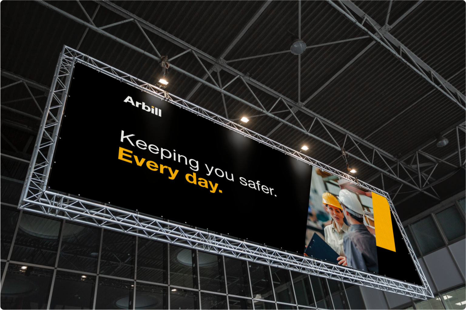
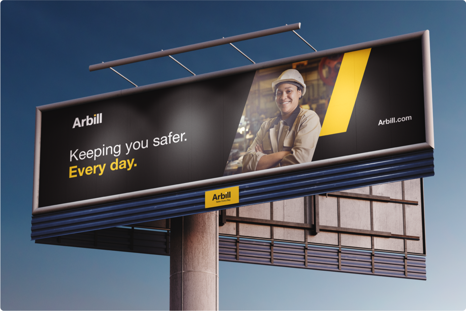
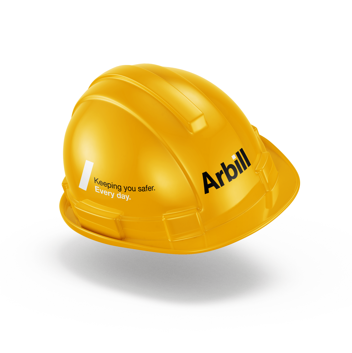
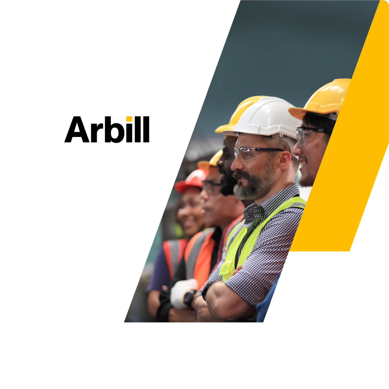
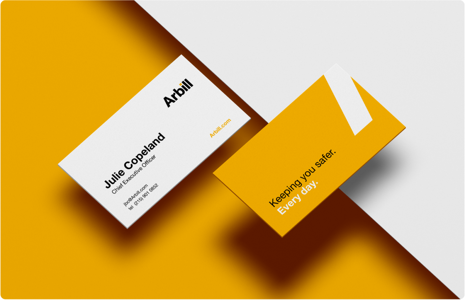
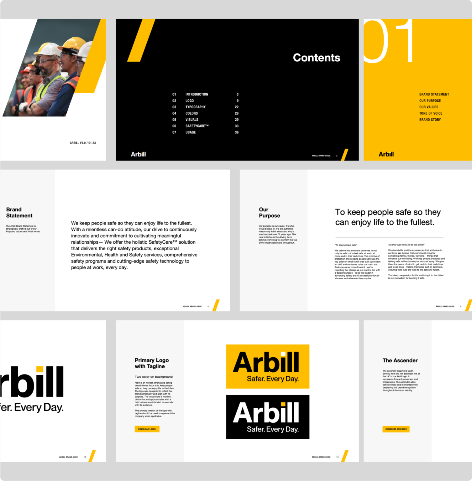
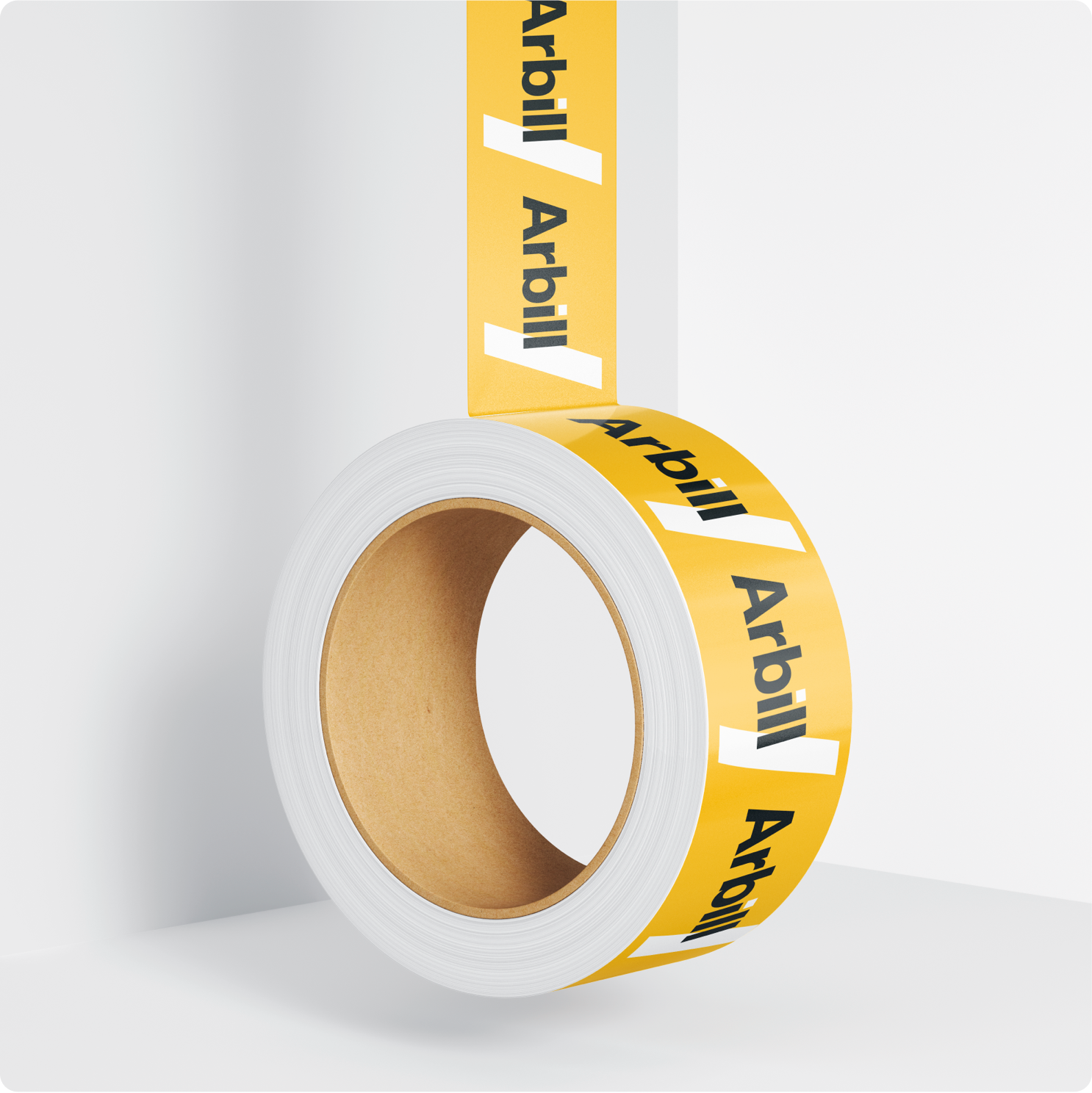
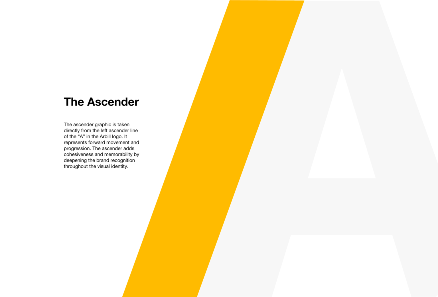
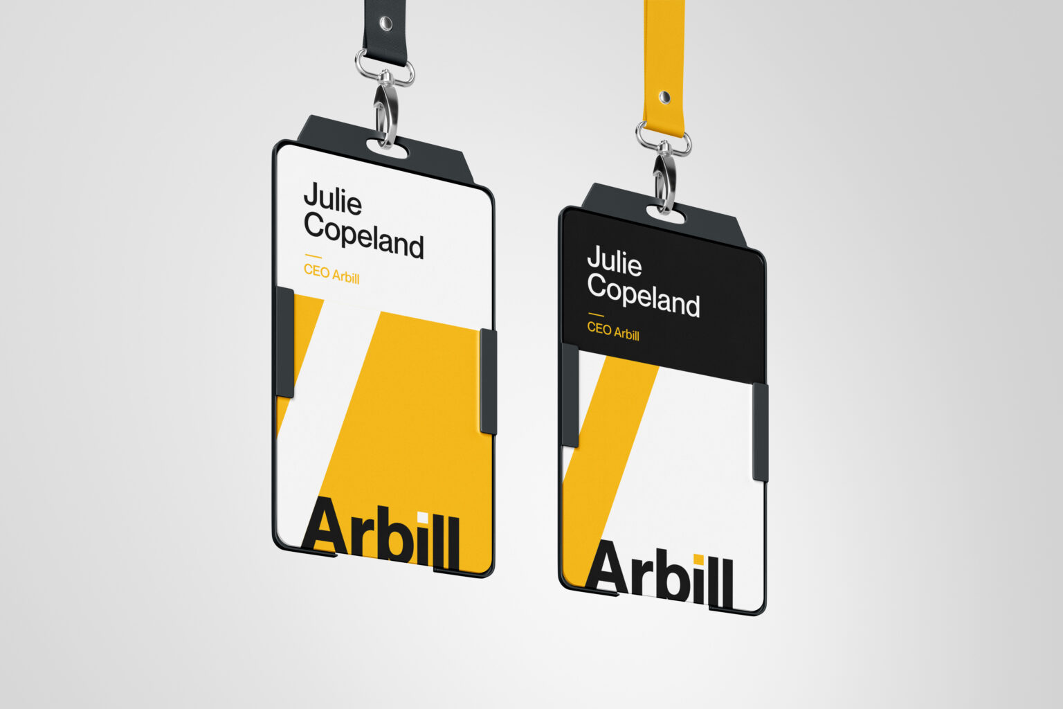
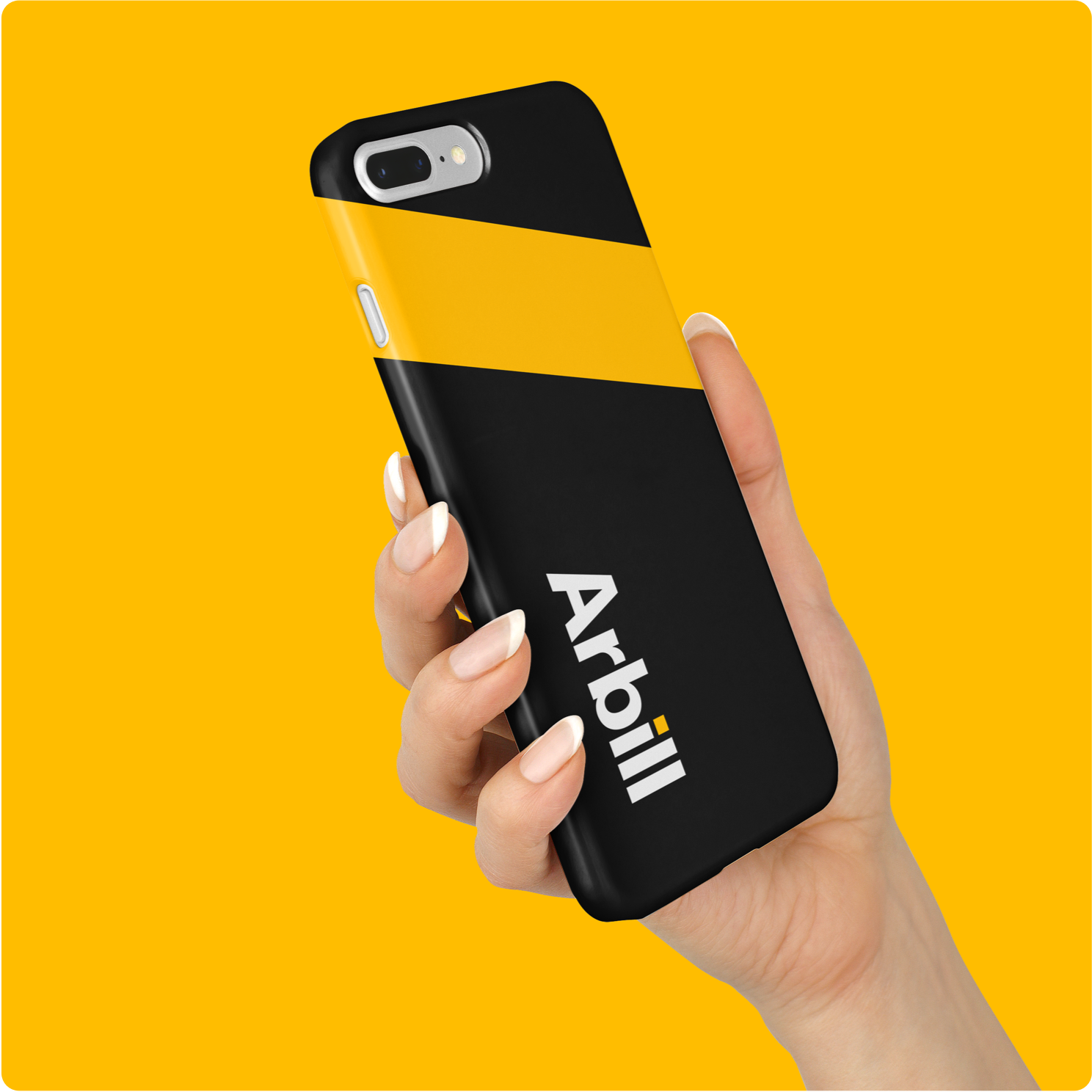
By leveraging Arbill's powerful mission, we designed the brand visuals to align with their purpose and passion. We refreshed the logo, enhanced colors and introduced new elements packed with meaning that ties the company history to its vision for the future. From business cards to the brand guide - our identity system helps Arbill keep a consistent, professional look both internally and with their external partners.

Verbal Identity
Crafting a brand voice and tone that speaks volumes
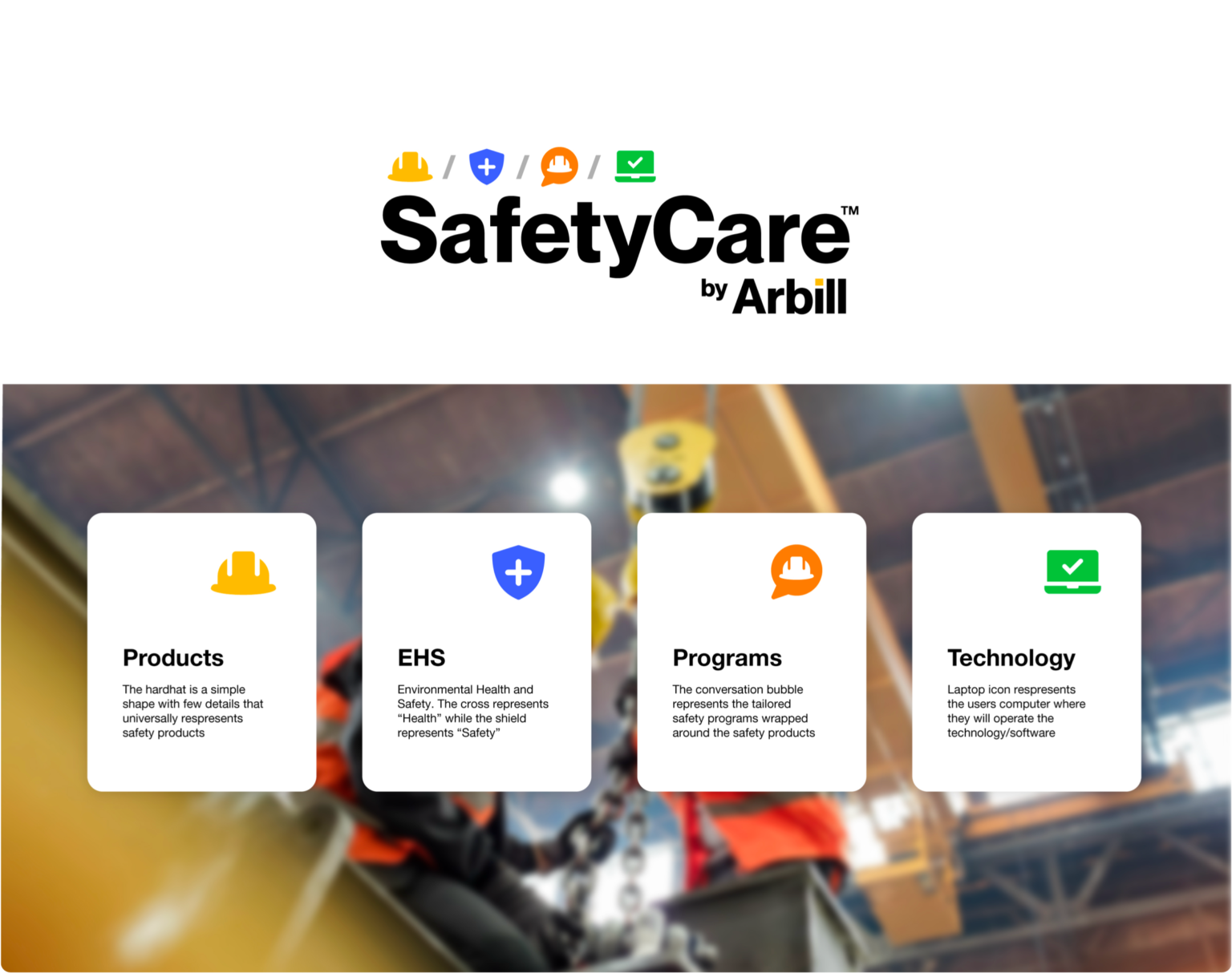
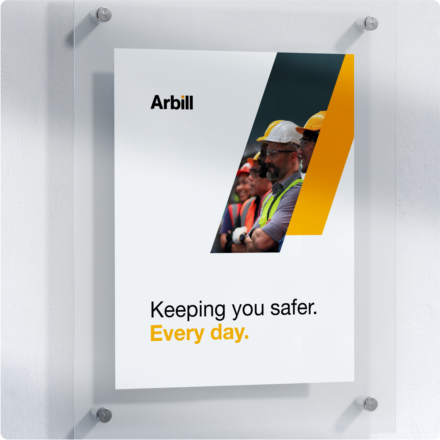
With the refreshed brand comes a new way of communicating. We took a close look at their audience to construct a personality, tone and messaging strategy that taps right to the heart of the decision makers. We crafted a a captivating brand story that brought together the past, present and future for use on the website, marketing and socials.

Client Testimonial
View all projectsPartnering with Wise+Hype has been transformative. They didn’t just evolve our brand — they helped us unlock the most powerful, future-forward version of Arbill. We’re stepping into this next chapter with more clarity, confidence, and momentum than ever before.
 Julie CopelandCEO, Arbill